The latter is the destination. The former is the journey.
May 31, 2017 at 8:41 am
Browncoat
Awesome response!
May 30, 2017 at 9:36 pm
Pamela
When’s the other shoe going to drop?
May 31, 2017 at 12:50 am
WayneM
I was thinking the same thing, Pamela…
Honesty from Skye is a novelty though… and her booby-angel is charming and fetching. I’m looking forward to seeing where this goes.
May 30, 2017 at 9:50 pm
formwiz
Ditto on the new theme.
Is the idea we’re seeing a lot more (ahem) of Skye mean a meta-physical match up of the sisters?
May 30, 2017 at 10:57 pm
JIMV
I’m not sure one can ever see ‘enough’ of Sky…
May 30, 2017 at 10:04 pm
JohninMd.(Help!?!!)
Zed better check the wiring…. Lotta stress there.
May 31, 2017 at 10:35 am
JavaMan
Maybe it’s Wade in the wiring helping emphasis the truth when it comes out
May 30, 2017 at 10:08 pm
Grunt GI
So the darker text is definitely better. It appears it’s easier to embed links which is cool.
As far as Skye, I say put her back in her DDQ outfit with Sam and see how hard she works.
Please.
D-6 days until Next Big Thing.
May 30, 2017 at 10:11 pm
Aldo Cella
I like the new look but I miss the twirly-ball-tag-thing.
May 31, 2017 at 8:11 pm
Bob in Houston-Vast Right Wing Basket of Deplorable!
At first glance I thought you said “twirly ball gag thing” and I was like , crap, is there an underground day by day link I’ve not noticed?? And yeah, I kinda liked the twirly tag thing but oh well.
High contrast is easier for old eyes to see. But it don’t bother me.
My only issue is the strip is smaller, I miss the (almost) full width display. Seeing the characters in large format is much more pleasant.
Don’t need a big calendar, its reference material.
WordPress 2 column is a bugger to work with, unimportant sidebar material gets too much landscape. Where did your sponsor and link list go?
Miss the swirly tag cloud. I tried to make that work with photographs as links, couldn’t get it sized and connected right. Cool effect.
But all in all, we still get to see the strip. Pun intended.
May 30, 2017 at 10:28 pm
Grunt GI
I can’t tell, does the strip seem smaller? I also wouldn’t mind it being bigger, but I think it’s the same size. I use the ol’ ZOOM IN, as needed for my old eyes.
May 31, 2017 at 8:13 pm
Bob in Houston-Vast Right Wing Basket of Deplorable!
Does kinda look smaller but then I just started using a 42 inch 4k television as a monitor.
The truth will set you free Skye. Not only are you listening to the white girl, the dark side ain’t even in view. Be careful though, demons’re sneaky; she’ll be back.
Ditto on what Grumps said about strip size in relation to fluff stuff.
Don’t like that the number of comments only shows up on the home page…once comments are opened that info bar is gone. I usually keep a DBD tab up during the day and refresh for new comments, I’ll miss that if we can’t get it back.
May 31, 2017 at 8:07 pm
Plasticman
THIS! I do the same with the comments. That’s how I know how to read down again. Now I have to go back to home, check the comment count (no change or change) and re-load the comments. A couple of extra steps that didn’t used to happen.
May 30, 2017 at 10:30 pm
Interventor
Skye speaking the truth stresses reality.
May 31, 2017 at 7:39 am
MasterDiver
I detect a GREAT disturbance in the Force!
Zar Belk!
May 31, 2017 at 8:02 am
eon
Maybe Skye’s never going to be a Jedi, but I’d settle for a Light Side Sith in her case.
clear ether
eon
May 30, 2017 at 11:12 pm
Deplorable B Woodman
Oh. My. G……..Skye. Speaking. Da. Trooff? NNOOOOOOOOOOO………The endtime is near.
May 31, 2017 at 12:12 am
Pamela
Only if you live in California is the end time near.
Skye on the other hand, is another issue all together.
She’s up to something and redemption is not on the menu.
May 31, 2017 at 12:02 am
tomcat.ak1972
Furiously scratching my head at Skye’s transformation. I rather like seeing more of Naomi.
May 31, 2017 at 12:21 am
Greg B
Sorry. Not liking the new layout.
Liking the nekkid angel, though.
May 31, 2017 at 12:53 am
S Hooks
Chris, the new layout is okay, as far as font, background, color, etc.. However, the loss of the ability to read the previous several days’ comments is really unfortunate for me. While I usually am able to drop in and read the strip each day, I don’t always have time to read the comments right then. Sometimes it’s three or four days before I’ll have time to go back and read through them to catch up.
While the strip is of course the most important thing, I really enjoy the comments, too. Please reinstate the availability of the comments at least for the current month, or however it was before the change.
May 31, 2017 at 2:19 am
armedandsafe
You beat me to it, Hooks.
May 31, 2017 at 7:51 am
Unca Walt
Me too.
May 31, 2017 at 8:00 am
Dave R
If you pick a date from the calendar, that strip is presented. Just above the strip on the left is the name of the strip, which is a link to the strip and comments for that day.
May 31, 2017 at 10:45 am
JIMV
How about adding an image attachment feature. On other forums I often add a political cartoon or a photo of someone I’ve known to make a point…
May 31, 2017 at 12:58 am
Sean
Things won’t be as much fun if Sky wakes up. You’ll have to create a new libtard character to take her place. Maybe she can have a brief “awakening”, but revert to her true nature eventually.
Wait. Was I just discussing the evil one or the format, or? ….
May 31, 2017 at 4:34 am
JackDeth72
This replying in “Light On White” background is a bit too close to my doing Crossword Puzzles with a crappy #2 mechanical pencil on even worse Washington Post, “Pravda On The Potomac” paper.
Don’t trust Skye. Even though I predicted her return weeks ago… Whenever her lips move. She’s lying!
May 31, 2017 at 6:06 am
Johnny Z
I liked the dark background a little better.
May 31, 2017 at 7:52 am
Unca Walt
Me too
May 31, 2017 at 6:47 am
GWB
On the new look….
– I can’t see boxes for the comments – just a line at the bottom. That’s ok for the “login” bits, but the comment itself is really weird to type (until I’m loquacious enough to make the scroll bar appear).
– The background color is a bit bright, but I can make that adjustment. (I think the contrast is mostly ok in the comments area.)
– Where I’m having trouble with the contrast is the buttons on the home page: on my screen, the active buttons immediately below the toon are very light, while the inactive buttons are bold-ish. Very backwards.
– The button below the tag cloud are correct in terms of emphasis.
– The toon does seem a little smaller.
– What’s up with a pencil icon for the reply buttons? It might be a font issue on my end, but if not, that’s not a normal visual cue for “reply” (says “edit” to me).
– Concur with JTC on the comments quantity only showing up on the home page.
– Concur with NYIAC on change in general. 😉
Just remember, change is not good. Change is change. Good change is good. And you really should punch anyone telling you “Change is good!” Especially if they’re chipper about it. :p /curmudgeon
May 31, 2017 at 6:52 am
Keith
Love the strip, and will be here as long as it is available and I am able. New format is ok but Agree with the others on darker font and larger strip. Only a suggestion but would appreciate replies to comments being indented. Makes it easier for me to tell the difference between a reply and a new comment. Again, love the strip; thanks for all you do, Chris.
May 31, 2017 at 6:57 am
Badger
Gray on really light gray is a big step backwards for my eyes, particularly with things that are intended to contrast as links. (Calendar is the worst of those, but just my $.02.) Frankly, the new format almost looks “google-ized.” The strip itself is fine; possibly an optical illusion that it seems smaller but the strip seemed “framed” better with the overall dark background. Nonetheless, drive on sir. Your house, your interior decorator.
🙂
May 31, 2017 at 7:14 am
PaulS
Light on white SUCKS on a phone! HC! My eyes.
May 31, 2017 at 7:29 am
Bill
Hate the new comment layout. What is this, Vouge Magazine? Ugh.
And WHY would you take a chance on Skye?
May 31, 2017 at 7:30 am
Crawdaddy Loon
Generally agree with the comments on font/background colors, but add one of my own. I used the Chapter box to look at the last few days of DBD – works well, except I tried to get back to today, and today was not selectable from the Chapter box! Had to use the “Click to Goback Arrow’ to get back! Not a big problem, since I had only gone back the previous 2 days as a test, but if I were wandering – ’cause I could! – I might have had to reload! Just a comment – it is the content, after all, not the format, that keeps us coming back!
May 31, 2017 at 4:26 pm
Don in AK
Crawdaddy, I found that clicking on the “Home” button takes you back to the current strip.
May 31, 2017 at 11:21 pm
Crawdaddy Loon
Thank you!
May 31, 2017 at 7:37 am
booch
I liked the old style much better for my eyes. The comment print colors kill my eyes.
May 31, 2017 at 9:08 am
Halley
Same here I’m afraid..
May 31, 2017 at 8:29 am
Halley
Speaking of flow, could someone pour some cream in my Irish-Japanese covfefe?
May 31, 2017 at 8:36 am
Paul
I like the new theme, however can I suggest making the actual comic a bit bigger, as it was on the previous theme? Just a tad hard to read, for me.
Of course, I’m becoming an old fart…
May 31, 2017 at 9:05 am
Grunt GI
So this is interesting, if you use the PREVIOUS button or click in a calendar day, the toon has no comments. If you use the month button at the bottom left of the calendar to get the previous month’s toons, then click on one of them, the comments are there.
So the comments are lost, I guess the only way to see them is to go with the month archive selection and then click on the toon you want to see.
Yeah, once you hit the previous button, the navigation buttons go away, so if you visit sporadically as I do, getting caught up is a PITA.
And weird comment box has no box….
May 31, 2017 at 9:14 am
Gina
So…Skye grows her hair back out, gets rid of the tats, is supposedly turning to the light and Mama-san (who is no fool) still cuts her off? Yeah, the good angel’s voice is only going to be listened to for so long…
No, Mama Birds kicks babies out of the nest when they’re ready to fly.
Of course this is at least the third time SkyeBird has been booted, so no guarantees, but so far it looks like she’s flying SkyeHigh on the wings of angels.
Hope she keeps it up, she’s incredibly lucky to have love and support to get another chance and that some nasty ground-dweller didn’t eat her up the last time (it was close). Birds, and peeps (heh) learn from what don’t kill ’em and as a metaphor for the fledglings following the left that will consume them, I have high hopes for Skye to make it.
OTOH, sometimes too many chances can have the opposite effect and enable another relapse, possibly a fatal one. We’ll see .
May 31, 2017 at 9:24 am
March Hare
As a Senior Citizen, darker text in the comments would be appreciated. However, I fought this battle at work and lost–gray text on white is the current trend.
May 31, 2017 at 9:56 am
doc
The new design is certainly cleaner and looks very good.
As far as desirable tweaks, I echo the desire of the others who commented about:
(a) the strip ideally being a little larger when it loads, and
(b) being able to see the comments from (at least a few) prior days … I often don’t get to see Saturday and Sunday’s strips until Monday morning.
May 31, 2017 at 10:07 am
Chris Muir
This is a template and we can’t do much with it.The comments will be working as they did by the end of June or so.
Yeah I knew that. Same thing my son said when he had an artsy website customer build him a fancy multi-page site in place of the simple but very functional homepage he built himself where you could see and access all the basics in one place.
thejewelrydr.com
Apparently I was wrong then too, his google and facebook presence have increased in the past year, meaning more folks find him and his reviews are awesome.
You and he were both similarly dicky about it, though my motives were pure…but selfish. But he’s still my boy. You too. 🙂
Dang, it’s like you think you own the place or something.
Speaking of June…is this the 6 June surprise you have taunted us with or do you have other schemes afoot?
May 31, 2017 at 10:48 am
azscram
I was taken by surprise with the new look, but this isn’t the first time that DayByDay has changed it’s look. Only those who adapt survive 🙂
Regarding Skye, the battle between good and evil rages in the hearts and minds as much as it does in the streets and battlefields. I’m wondering this means we’ll see a cat fight between the mini Skye angel and devil. One can always hope.
May 31, 2017 at 11:06 am
Pamela
I like the fact that the background has some texture and subtle shading to it now.
It reminds me of the paper in some older books. There was a tactile feel to it.
Like stroking a lover’s skin.
Plus the print font is now darker with a better contrast to the background.
The pencils are now in Red, as are the buttons with data already attached.
Coolness Mr. Muir. If you were close by, I’d give you a kiss.
May 31, 2017 at 11:12 am
Pamela
Yo! Landlubbers! As my Dad used to say, this is a shakedown cruise to work out all the kinks, bugs and gremlins. Patience Grasshoppers. In due time. Patience.
May 31, 2017 at 1:20 pm
John
Funny thing is the impatient grasshoppers are the feedback.
May 31, 2017 at 3:42 pm
NotYetInACamp
I am feeling so Progressive.
The tactile feel. the stroking …
… mayhaps I should consider the other things that I could be made to feel?
Ya know. I actually sailed competitively in college. I did not realize that until much later as I just considered it going down to the lake for a sail. Sometimes I would get in the sailboat and sometimes come in ahead of the others on a course. I did know the home lake winds, gusts, puffs and stuff from my afternoon after class sails and sailboat maintenance. I should have got a participation award as I now remember that I actually won some of them for us. I might have made a close field regatta trip or so, or not. I lub much land these days. Taught friends how to use their vessels …
I feel so formal writing here. I can’t dismiss it as just messing around with a bunch of characters. I mean.. I like artistic and the fonts, and uh … I liked the massive amount of comments contained on one screen … I have to use more motions to read the same amount of copy .. .. I feel like Mo, Larry, and Curly being called gentlemen and then trained, and then getting them into the penguin suits. I feel so…. distracted … so.. so… uh .. pardone muah. I must pass some wind….
May 31, 2017 at 4:28 pm
Pamela
Ow, my side and thank God I put the coffee cup down.
I’ve always had a yearning to … no, I better not say that about Men and the Ships they sail. A sea shanty is in order me thinks.
It is now too hard to read. The font fuzzes out on my less than perfect screen and I get a headache/eyestrain trying to focus on soft edges. It’s also too bright a background. But it’s your play ground so your rules, I’ll just read the strip for the day and skip the comments when my eyes hurt.
Spin
War Damn Screaming Eagle
May 31, 2017 at 5:25 pm
Unca Walt
Spin Drift’s description is EXACTLY my problem. Eyestrain/headache from brightness while trying to read.
Respectfully submitted.
May 31, 2017 at 12:29 pm
PaulS
I’m typing in a field that is indistinguishable from the background.
Can I live with it? Yeah
Can I live without it? Yeah
There’s always a choice. Is the juice worth the squeeze?
Well, well, well… looky what we gots here! Nice new layout, Chris. I agreed with the early commenters about the comment fonts needing to be darker, and that fix was quick. IMHO the font may be a little too skinny/cramped, especially with a lot of text.
Re: the cartoon size, I don’t know what everyone is talking’ about. The width was always 575x??? (at least for non-Sunday strips). The length always changed from toon to toon depending on what you were drawing.
I really like and appreciate the “Chapters” pulldown menu (which currently goes all the way back to 2008 by month, with the remaining lumped into the “early years”).
Your “About” section has a weird “[[sg_popup id=”1″ event=”onload”][/sg_popup]” text at the bottom of the page (and I think you may need to update that page with a fuller list of characters). Just a lil suggestion. 😉
All in all, a nice switch over. I’d personally darken the gray background just a tad more, but other than that… thumbs up!
One more thing, as an FYI. The little black rectangle just below the tag bubble, with the white “<<First <Prev Comments Random" text. The text inside that rectangle is extremely blurry.
May 31, 2017 at 1:09 pm
Neil Frandsen
Black typeface, on grey background, works fine. on Samsung SyncMaster 2253LW.
For larger comic view, [Ctrl]+, repeated a couple, 3 times, works just fine, on Windows 10, in Avast SafeZone Browser.
:
Note: I cleaned out Browser History, which took a while last night. Browser runs faster, now.
May 31, 2017 at 1:56 pm
Kafiroon
I dunno Chris; Seems you have a lot of half blind old farts here. Course, me being one of the first of them to kevetch.
I will just wait it out and keep on with the site and wait to see what you end up with.
Ignoring a lot of us is also a path that can be taken, according to my wife at times. Heh.
May 31, 2017 at 3:09 pm
Wicked Duke
Like the new layout, and ‘blowing up’ the display to 200% (cause my eyes are really not so good these days) works good enough.
Keep on truckin’ CM, just keep on truckin’ along… 🙂
May 31, 2017 at 3:30 pm
Old Tanker
So I click on DBD and a ghost page appears enticing me to check out http://www.redvolution.com (nice drawing Chris) before quickly disappearing, but it takes me to a GoDaddy advertisement. Whats up?
Coming Soon! From the looks of them, I would guess both of them…..
May 31, 2017 at 8:42 pm
NotYetInACamp
Nice name snatch.
May 31, 2017 at 3:33 pm
Old Tanker
OK, I left 1776 out of the address, but still nothing. Is this the June surprise?
May 31, 2017 at 3:51 pm
Chris Muir
A new DBD toon, written by Sam.The address will go active soon.
May 31, 2017 at 4:08 pm
Pamela
Should be interesting.
Though whomever the Man with the queue is, he needs some salve for his back.
May 31, 2017 at 5:32 pm
Old Tanker
Good catch on the queue. Didn’t notice it until you mentioned it.
May 31, 2017 at 5:17 pm
Grunt GI
Wooohooo…can’t wait.
Looks very patriotic.
Love the caption.
May 31, 2017 at 6:13 pm
Pamela
Back to a time when life was rough and at the ready.
When corsets and garters could be used as weapons for the Cause of Freedom. Along with a carefully concealed dagger. Back to when a CCW or bullet buttons were not even thoughts in the wind.
May 31, 2017 at 3:58 pm
epador
Old folks hate change. But they love it when its good.
I’m going to let the dust settle before saying much about the changes.
I will say the old higher contrast white letters/black background was easier to read. But that’ mostly just personal preference. I know some sites give layout options (ie color/bg options selections that regular visitors can select). Might be nice to offer the old color scheme (in the new style) as an alternative for those of us who suffer with imperfect vision. 😉
Only two things that actually seem buggy. First, as some have noted is the first/Previous // Next/ Last bar is only on the home page. To get to previous pages one has to scroll down to the very bottom of the page and select ‘Previous Post’.
The other issue is that the scrolling down the page isn’t smooth like it used to be. It’s much choppier either with the scroll wheel or by the side bar. Don’t know if that might be related in the coding/java/whatever. But it is definitely noticeable.
All in all, though, not a bad change. Keep up with the wonderful work!
May 31, 2017 at 10:48 pm
Pamela
Chris~ Point of order. Nail polish/varnish/lacquer was not around in 1776.
Stockings in silk, cotton and wool were available, and only Women in the French Court were hairless in their nether regions.
May 31, 2017 at 10:49 pm
Chris Muir
It’s not set in this America.
May 31, 2017 at 10:59 pm
Pamela
Ah well then I guess women can be hairless in their nether regions if they so choose in the alternate timeline.
May 31, 2017 at 11:58 pm
Deplorable B Woodman
Hokey Smokes! I just logged in to see if the new ‘toon was up for tomorrow, and check today’s comments.
I got an amazing 5 second popup, a hint of things to “come”, I suppose.
It was so amazing, I had to back out and come back in again, just to make sure I wasn’t hallucinating. Nope, not hallucinating.
June 1, 2017 at 2:19 am
NotYetInACamp
Hm. Unlimited commenting?
I block the pop ups. I suppose that I will wait for the site to fully go online.
June 1, 2017 at 7:46 am
tomstockton
I’ve been thinking I’ve seen Skye’s “little helpers” before. Then it came to me — the “femlin” which made two appearances a month on Playboy’s Party Jokes page… on the back of the last page of the centerfold. Brings back some memories!
112 Comments
Like the new page design. Very clean. Only issue for me is the light grey text on white background is a little hard to read.
Agreed…Please darken the font on the comments if possible…otherwise WOW!
I’m a ole pussy, I guess. The light background/light type gives me a headache.
Your house, though, Chris. But it feels a lot like looking into a flashlight.
I agree….medium grey background with black font works for me…..this white background is very uncomfortable, like looking into the sun….thanks….
That is the quickest response I’ve ever seen….thanks….much easier on these old eyes….
Yep. Definitely better now.
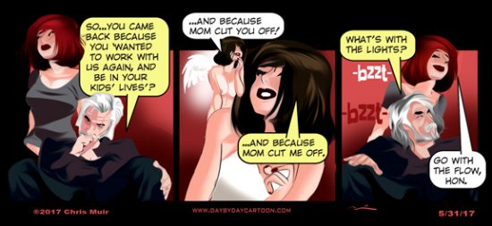
Hmm… Skye shows up and the lights start to flicker. Kinda like when the Terminator first showed up. Does this bode well?
No AND
Nuh-uh
This SKANK will never change
Honesty. From Skye.
Is this the road to Damascus- or Samara?
clear ether
eo
Both.
The latter is the destination. The former is the journey.
Awesome response!
When’s the other shoe going to drop?
I was thinking the same thing, Pamela…
Honesty from Skye is a novelty though… and her booby-angel is charming and fetching. I’m looking forward to seeing where this goes.
Ditto on the new theme.
Is the idea we’re seeing a lot more (ahem) of Skye mean a meta-physical match up of the sisters?
I’m not sure one can ever see ‘enough’ of Sky…
Zed better check the wiring…. Lotta stress there.
Maybe it’s Wade in the wiring helping emphasis the truth when it comes out
So the darker text is definitely better. It appears it’s easier to embed links which is cool.
As far as Skye, I say put her back in her DDQ outfit with Sam and see how hard she works.
Please.
D-6 days until Next Big Thing.
I like the new look but I miss the twirly-ball-tag-thing.
At first glance I thought you said “twirly ball gag thing” and I was like , crap, is there an underground day by day link I’ve not noticed?? And yeah, I kinda liked the twirly tag thing but oh well.
High contrast is easier for old eyes to see. But it don’t bother me.
My only issue is the strip is smaller, I miss the (almost) full width display. Seeing the characters in large format is much more pleasant.
Don’t need a big calendar, its reference material.
WordPress 2 column is a bugger to work with, unimportant sidebar material gets too much landscape. Where did your sponsor and link list go?
Miss the swirly tag cloud. I tried to make that work with photographs as links, couldn’t get it sized and connected right. Cool effect.
But all in all, we still get to see the strip. Pun intended.
I can’t tell, does the strip seem smaller? I also wouldn’t mind it being bigger, but I think it’s the same size. I use the ol’ ZOOM IN, as needed for my old eyes.
Does kinda look smaller but then I just started using a 42 inch 4k television as a monitor.
The truth will set you free Skye. Not only are you listening to the white girl, the dark side ain’t even in view. Be careful though, demons’re sneaky; she’ll be back.
Ditto on what Grumps said about strip size in relation to fluff stuff.
Don’t like that the number of comments only shows up on the home page…once comments are opened that info bar is gone. I usually keep a DBD tab up during the day and refresh for new comments, I’ll miss that if we can’t get it back.
THIS! I do the same with the comments. That’s how I know how to read down again. Now I have to go back to home, check the comment count (no change or change) and re-load the comments. A couple of extra steps that didn’t used to happen.
Skye speaking the truth stresses reality.
I detect a GREAT disturbance in the Force!
Zar Belk!
Maybe Skye’s never going to be a Jedi, but I’d settle for a Light Side Sith in her case.
clear ether
eon
Oh. My. G……..Skye. Speaking. Da. Trooff? NNOOOOOOOOOOO………The endtime is near.
Only if you live in California is the end time near.
Skye on the other hand, is another issue all together.
She’s up to something and redemption is not on the menu.
Furiously scratching my head at Skye’s transformation. I rather like seeing more of Naomi.
Sorry. Not liking the new layout.
Liking the nekkid angel, though.
Chris, the new layout is okay, as far as font, background, color, etc.. However, the loss of the ability to read the previous several days’ comments is really unfortunate for me. While I usually am able to drop in and read the strip each day, I don’t always have time to read the comments right then. Sometimes it’s three or four days before I’ll have time to go back and read through them to catch up.
While the strip is of course the most important thing, I really enjoy the comments, too. Please reinstate the availability of the comments at least for the current month, or however it was before the change.
You beat me to it, Hooks.
Me too.
If you pick a date from the calendar, that strip is presented. Just above the strip on the left is the name of the strip, which is a link to the strip and comments for that day.
How about adding an image attachment feature. On other forums I often add a political cartoon or a photo of someone I’ve known to make a point…
Things won’t be as much fun if Sky wakes up. You’ll have to create a new libtard character to take her place. Maybe she can have a brief “awakening”, but revert to her true nature eventually.
Cool with the new layout, just going to take getting used to. As for the Zed thing, Saul to Paul, brother. Saul to Paul.
Couldn’t find the comment box. Too much the same shade. Mini Skye is cute.
Turned to DBD, like I do every night as soon as I get home from work and…ZAPP!!
All this Retina-Searing WHITE!!!! Ack!!
AAAAIIIIIIIIIIIIIIIIIIIEEEEEEEEEEEEEEEEEEEEE !!!
CHANGE !!!!! NOOOOOOOOOOOO!!!!
Wait. Was I just discussing the evil one or the format, or? ….
This replying in “Light On White” background is a bit too close to my doing Crossword Puzzles with a crappy #2 mechanical pencil on even worse Washington Post, “Pravda On The Potomac” paper.
Don’t trust Skye. Even though I predicted her return weeks ago… Whenever her lips move. She’s lying!
I liked the dark background a little better.
Me too
On the new look….
– I can’t see boxes for the comments – just a line at the bottom. That’s ok for the “login” bits, but the comment itself is really weird to type (until I’m loquacious enough to make the scroll bar appear).
– The background color is a bit bright, but I can make that adjustment. (I think the contrast is mostly ok in the comments area.)
– Where I’m having trouble with the contrast is the buttons on the home page: on my screen, the active buttons immediately below the toon are very light, while the inactive buttons are bold-ish. Very backwards.
– The button below the tag cloud are correct in terms of emphasis.
– The toon does seem a little smaller.
– What’s up with a pencil icon for the reply buttons? It might be a font issue on my end, but if not, that’s not a normal visual cue for “reply” (says “edit” to me).
– Concur with JTC on the comments quantity only showing up on the home page.
– Concur with NYIAC on change in general. 😉
Just remember, change is not good. Change is change. Good change is good. And you really should punch anyone telling you “Change is good!” Especially if they’re chipper about it. :p /curmudgeon
Love the strip, and will be here as long as it is available and I am able. New format is ok but Agree with the others on darker font and larger strip. Only a suggestion but would appreciate replies to comments being indented. Makes it easier for me to tell the difference between a reply and a new comment. Again, love the strip; thanks for all you do, Chris.
Gray on really light gray is a big step backwards for my eyes, particularly with things that are intended to contrast as links. (Calendar is the worst of those, but just my $.02.) Frankly, the new format almost looks “google-ized.” The strip itself is fine; possibly an optical illusion that it seems smaller but the strip seemed “framed” better with the overall dark background. Nonetheless, drive on sir. Your house, your interior decorator.
🙂
Light on white SUCKS on a phone! HC! My eyes.
Hate the new comment layout. What is this, Vouge Magazine? Ugh.
And WHY would you take a chance on Skye?
Generally agree with the comments on font/background colors, but add one of my own. I used the Chapter box to look at the last few days of DBD – works well, except I tried to get back to today, and today was not selectable from the Chapter box! Had to use the “Click to Goback Arrow’ to get back! Not a big problem, since I had only gone back the previous 2 days as a test, but if I were wandering – ’cause I could! – I might have had to reload! Just a comment – it is the content, after all, not the format, that keeps us coming back!
Crawdaddy, I found that clicking on the “Home” button takes you back to the current strip.
Thank you!
I liked the old style much better for my eyes. The comment print colors kill my eyes.
Same here I’m afraid..
Speaking of flow, could someone pour some cream in my Irish-Japanese covfefe?
I like the new theme, however can I suggest making the actual comic a bit bigger, as it was on the previous theme? Just a tad hard to read, for me.
Of course, I’m becoming an old fart…
So this is interesting, if you use the PREVIOUS button or click in a calendar day, the toon has no comments. If you use the month button at the bottom left of the calendar to get the previous month’s toons, then click on one of them, the comments are there.
So the comments are lost, I guess the only way to see them is to go with the month archive selection and then click on the toon you want to see.
Yeah, once you hit the previous button, the navigation buttons go away, so if you visit sporadically as I do, getting caught up is a PITA.
And weird comment box has no box….
So…Skye grows her hair back out, gets rid of the tats, is supposedly turning to the light and Mama-san (who is no fool) still cuts her off? Yeah, the good angel’s voice is only going to be listened to for so long…
No, Mama Birds kicks babies out of the nest when they’re ready to fly.
Of course this is at least the third time SkyeBird has been booted, so no guarantees, but so far it looks like she’s flying SkyeHigh on the wings of angels.
Hope she keeps it up, she’s incredibly lucky to have love and support to get another chance and that some nasty ground-dweller didn’t eat her up the last time (it was close). Birds, and peeps (heh) learn from what don’t kill ’em and as a metaphor for the fledglings following the left that will consume them, I have high hopes for Skye to make it.
OTOH, sometimes too many chances can have the opposite effect and enable another relapse, possibly a fatal one. We’ll see .
As a Senior Citizen, darker text in the comments would be appreciated. However, I fought this battle at work and lost–gray text on white is the current trend.
The new design is certainly cleaner and looks very good.
As far as desirable tweaks, I echo the desire of the others who commented about:
(a) the strip ideally being a little larger when it loads, and
(b) being able to see the comments from (at least a few) prior days … I often don’t get to see Saturday and Sunday’s strips until Monday morning.
This is a template and we can’t do much with it.The comments will be working as they did by the end of June or so.
Kill the template and revert to the old comfy site?
Yeah, like I said, I’m old and change don’t come easy.
But, I know, it’s a work in progress and it’s gettin’ better, and like everybody else, I’ll take the bad with all the good.
Don’t mean I gotta like it.
No.
Well, it’s all good. As we used to say, if sailors ain’t bitching, sailors ain’t happy.
I’m sure all will be well shortly..
Thanks for the update….
“No.”
Yeah I knew that. Same thing my son said when he had an artsy website customer build him a fancy multi-page site in place of the simple but very functional homepage he built himself where you could see and access all the basics in one place.
thejewelrydr.com
Apparently I was wrong then too, his google and facebook presence have increased in the past year, meaning more folks find him and his reviews are awesome.
You and he were both similarly dicky about it, though my motives were pure…but selfish. But he’s still my boy. You too. 🙂
Dang, it’s like you think you own the place or something.
https://www.thejewelrydr.com/
Speaking of June…is this the 6 June surprise you have taunted us with or do you have other schemes afoot?
I was taken by surprise with the new look, but this isn’t the first time that DayByDay has changed it’s look. Only those who adapt survive 🙂
Regarding Skye, the battle between good and evil rages in the hearts and minds as much as it does in the streets and battlefields. I’m wondering this means we’ll see a cat fight between the mini Skye angel and devil. One can always hope.
I like the fact that the background has some texture and subtle shading to it now.
It reminds me of the paper in some older books. There was a tactile feel to it.
Like stroking a lover’s skin.
Plus the print font is now darker with a better contrast to the background.
The pencils are now in Red, as are the buttons with data already attached.
Coolness Mr. Muir. If you were close by, I’d give you a kiss.
Yo! Landlubbers! As my Dad used to say, this is a shakedown cruise to work out all the kinks, bugs and gremlins. Patience Grasshoppers. In due time. Patience.
Funny thing is the impatient grasshoppers are the feedback.
I am feeling so Progressive.
The tactile feel. the stroking …
… mayhaps I should consider the other things that I could be made to feel?
Ya know. I actually sailed competitively in college. I did not realize that until much later as I just considered it going down to the lake for a sail. Sometimes I would get in the sailboat and sometimes come in ahead of the others on a course. I did know the home lake winds, gusts, puffs and stuff from my afternoon after class sails and sailboat maintenance. I should have got a participation award as I now remember that I actually won some of them for us. I might have made a close field regatta trip or so, or not. I lub much land these days. Taught friends how to use their vessels …
I feel so formal writing here. I can’t dismiss it as just messing around with a bunch of characters. I mean.. I like artistic and the fonts, and uh … I liked the massive amount of comments contained on one screen … I have to use more motions to read the same amount of copy .. .. I feel like Mo, Larry, and Curly being called gentlemen and then trained, and then getting them into the penguin suits. I feel so…. distracted … so.. so… uh .. pardone muah. I must pass some wind….
Ow, my side and thank God I put the coffee cup down.
I’ve always had a yearning to … no, I better not say that about Men and the Ships they sail. A sea shanty is in order me thinks.
https://www.youtube.com/watch?v=qGyPuey-1Jw
crawling out of the longboat … did I miss something? YES!!! AAAIIIEEE!! CHANGE !!!!!!! NNOOOOOOO!!!!!!!!!!! crawls back in. …
If you like sea shanties you might give Holdstock & Macleod a try… https://www.youtube.com/results?search_query=holdstock+macleod+deepwater+shanties
I thank you Good Sir
Chris:
It is now too hard to read. The font fuzzes out on my less than perfect screen and I get a headache/eyestrain trying to focus on soft edges. It’s also too bright a background. But it’s your play ground so your rules, I’ll just read the strip for the day and skip the comments when my eyes hurt.
Spin
War Damn Screaming Eagle
Spin Drift’s description is EXACTLY my problem. Eyestrain/headache from brightness while trying to read.
Respectfully submitted.
I’m typing in a field that is indistinguishable from the background.
Can I live with it? Yeah
Can I live without it? Yeah
There’s always a choice. Is the juice worth the squeeze?
Well, well, well… looky what we gots here! Nice new layout, Chris. I agreed with the early commenters about the comment fonts needing to be darker, and that fix was quick. IMHO the font may be a little too skinny/cramped, especially with a lot of text.
Re: the cartoon size, I don’t know what everyone is talking’ about. The width was always 575x??? (at least for non-Sunday strips). The length always changed from toon to toon depending on what you were drawing.
I really like and appreciate the “Chapters” pulldown menu (which currently goes all the way back to 2008 by month, with the remaining lumped into the “early years”).
Your “About” section has a weird “[[sg_popup id=”1″ event=”onload”][/sg_popup]” text at the bottom of the page (and I think you may need to update that page with a fuller list of characters). Just a lil suggestion. 😉
All in all, a nice switch over. I’d personally darken the gray background just a tad more, but other than that… thumbs up!
One more thing, as an FYI. The little black rectangle just below the tag bubble, with the white “<<First <Prev Comments Random" text. The text inside that rectangle is extremely blurry.
Black typeface, on grey background, works fine. on Samsung SyncMaster 2253LW.
For larger comic view, [Ctrl]+, repeated a couple, 3 times, works just fine, on Windows 10, in Avast SafeZone Browser.
:
Note: I cleaned out Browser History, which took a while last night. Browser runs faster, now.
I dunno Chris; Seems you have a lot of half blind old farts here. Course, me being one of the first of them to kevetch.
I will just wait it out and keep on with the site and wait to see what you end up with.
Ignoring a lot of us is also a path that can be taken, according to my wife at times. Heh.
Like the new layout, and ‘blowing up’ the display to 200% (cause my eyes are really not so good these days) works good enough.
Keep on truckin’ CM, just keep on truckin’ along… 🙂
So I click on DBD and a ghost page appears enticing me to check out http://www.redvolution.com (nice drawing Chris) before quickly disappearing, but it takes me to a GoDaddy advertisement. Whats up?
Nice flashpic, “Join or Die”, but fuck GoDaddy.
You have it wrong. 😉
http://redvolution1776.com
Coming Soon! From the looks of them, I would guess both of them…..
Nice name snatch.
OK, I left 1776 out of the address, but still nothing. Is this the June surprise?
A new DBD toon, written by Sam.The address will go active soon.
Should be interesting.
Though whomever the Man with the queue is, he needs some salve for his back.
Good catch on the queue. Didn’t notice it until you mentioned it.
Wooohooo…can’t wait.
Looks very patriotic.
Love the caption.
Back to a time when life was rough and at the ready.
When corsets and garters could be used as weapons for the Cause of Freedom. Along with a carefully concealed dagger. Back to when a CCW or bullet buttons were not even thoughts in the wind.
Old folks hate change. But they love it when its good.
I’ve got the redvolution thing bookmarked on my list. It will be right there on my instant click right next to DbD,
You’ll be able to click to it from the DBD front page…it’s Sam’s new Novel!
Graphic novel, I hope… Literally as well as figuratively. 😉
Hot DAMN!
Woo looking forward to Revolution1776!
I’m going to let the dust settle before saying much about the changes.
I will say the old higher contrast white letters/black background was easier to read. But that’ mostly just personal preference. I know some sites give layout options (ie color/bg options selections that regular visitors can select). Might be nice to offer the old color scheme (in the new style) as an alternative for those of us who suffer with imperfect vision. 😉
Only two things that actually seem buggy. First, as some have noted is the first/Previous // Next/ Last bar is only on the home page. To get to previous pages one has to scroll down to the very bottom of the page and select ‘Previous Post’.
The other issue is that the scrolling down the page isn’t smooth like it used to be. It’s much choppier either with the scroll wheel or by the side bar. Don’t know if that might be related in the coding/java/whatever. But it is definitely noticeable.
All in all, though, not a bad change. Keep up with the wonderful work!
Chris~ Point of order. Nail polish/varnish/lacquer was not around in 1776.
Stockings in silk, cotton and wool were available, and only Women in the French Court were hairless in their nether regions.
It’s not set in this America.
Ah well then I guess women can be hairless in their nether regions if they so choose in the alternate timeline.
Hokey Smokes! I just logged in to see if the new ‘toon was up for tomorrow, and check today’s comments.
I got an amazing 5 second popup, a hint of things to “come”, I suppose.
It was so amazing, I had to back out and come back in again, just to make sure I wasn’t hallucinating. Nope, not hallucinating.
Hm. Unlimited commenting?
I block the pop ups. I suppose that I will wait for the site to fully go online.
I’ve been thinking I’ve seen Skye’s “little helpers” before. Then it came to me — the “femlin” which made two appearances a month on Playboy’s Party Jokes page… on the back of the last page of the centerfold. Brings back some memories!